Ever since Gutenberg introduced the printing press in Europe, our main form of transferring and consuming information has been the written text. The average person speaks between 125 and 150 words per minute, but the top readers can reach speeds of over 1,000 words per minute. Therefore, reading is the most efficient way of acquiring information. The internet has utterly flooded us with written content of all kinds; Elon Musk, the CEO of Tesla and SpaceX, stated in an interview that he felt that listening to lectures makes learning way slower than reading.
Readability in a Digital Age
Although the internet provides a wealth of information, it also presents a new kind of challenge for content creators. In its printed form, editors can easily determine the shape of letters, its spacing, and the final visual form of how the information will be presented to the readers. Things get much more complicated digitally.
When reading online articles, the content is displayed differently on different screen sizes. There is a lot of work and thought needed to make it a great experience for every reader, with complicated algorithms determining how to break up sentences and coding choices to align paragraphs or space letters and words apart. Web typography became both a science and an art at the same time.
The average person in the United States spends more than ten hours looking at screens and as we become more and more dependent on online content all over the world, it is vital that we create and deliver it in a way that is pleasant, engaging and easy to read.
It is also important to take into consideration reading habits. Most of the time people don’t sit in a quiet library but instead read on their smartphones while in a busy environment surrounded by distractions. Making sure that the reader finds the information that they are looking for requires a consideration of how easy it is to skim through the content. Articles should be well presented and structured accordingly, with the contrast between the text and background playing an important role in this.
Designing Web Content to Your Style
While laying the written word out has its own difficulties and challenges, it also provides ways to enhance text with special effects, animations, or interactivity. It can be much more immersive reading content alongside embedded videos, live chats, or forums. These possibilities can bring the content closer to the readers and improve their experience, but it’s necessary to make sure that the number of possibilities don’t distract from delivering consistency.
While speech can offers greater complexity through rhetoric elements, facial expressions, or intonations, expressing writing is somewhat constrained. In particular this is limited to letter spacing, font styling, contrasts, and colors. Some typefaces (sets of font styles) can represent playfulness, while others might invoke seriousness. A scientific article or a news story both require different tones from an online casino review or an article about football betting. These differences should be represented by adequate choices in typography, styling, and how text appears on the page.
Web typography is about conveying the right message, being easy to scan through, and at the same time being visually pleasing. The number of words in each line, choice of typefaces, and density of words all greatly influence the overall engagement and experience with the content that is a core value that aim to provide.
How clovio Handles Typography and Readability
We value consistency and quality, so we’re always looking to constantly improve the user experience.
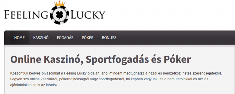
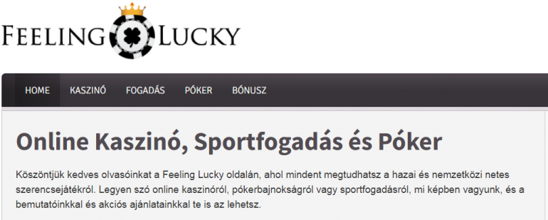
For example, some experts recommend having between 45 and 75 characters for a single column layout article. This is why we have increased the character size across the Feeling Lucky sites to make it easier for our users to consume the content by reducing its previously long lines of text into more readable chunks. Alongside this we have made other modifications to make the reading experience more pleasant and more visually pleasing.
While our content creators here at clovio are working hard to create useful insights that are both interesting and helpful to readers, our web developers place emphasis on presenting our articles in a professional, easily consumable, yet fun way. We believe that content has to be valuable and that readers feel that their time spent reading it is time well spent. We respect those that visit our sites by providing them with well researched, properly structured, and pleasantly presented content, and the right typographical choices are vital in achieving this.


Leave a Reply